Archives for category: Uncategorized

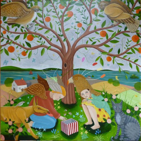
Tea with Miss Fox was always an awkward affair

A bit about the picture first… This is an oil painting, approx 4′ x 4′ square (must get into metric someday), painted this year and titled ‘Tea with Miss Fox was always an awkward affair’. It’s currently on display at Despard Gallery, Tasmania, as part of their Christmas exhibition. The technique is a bit different from usual: I’ve used burnt umber and titanium white only for the underpainting, then used very thin coloured glazes over the top. Quite enjoyed the change in paint application, actually, a bit of an artist’s holiday from the norm. It all started when I decided to do a joint exhibition (‘Strange Tales’) with the sculptor KRS. Now KRS’s work is dark, figurative, often melancholic, expressive and tonally low key. Mine is usually high key, figurative, and whack job funny. I guess we don’t have much in common, so deciding to do the show of her sculptures and my paintings risked the creation of a very jarring visual clash. So I started painting in dark browns and white, trying to key the whole thing down a bit, really enjoyed the stripped back nature of the thing: walking into your studio and the only tubes of paint you touch are brown and white, kind of cool for a change. And actually, not to sound parsimonious, but also a remarkably cheap way to paint given that these pigments are at the lower end of the price range.

As it was, I got to the end of the underpainting, and was so relieved to be back into colour that the glazes ended up typically OTT. Note to self: must acquire some subtlety, turning fourty next year, must begin to acquire a taste for beige and nuetrals. Currently thinking f**k that.

My daughter has a toy fox, wearing a brown velvet dress and lace petticoat, predictably named Miss Fox. As a single parent you end up doing strange things, one of which is sitting down to tea with you, your daughter and a stuffed toy fox- it’s glassy eyes peering over the edge of the table at you. Unsettling. Blend this with a love of Dickens, Great Expectations, Estella, and the whole idea of strange dinner parties (the abandoned wedding feast, left untouched for years when Mr Right didn’t show up, the plates and rotten foot covered with spider webs) and you have the genesis of the image. There was something else I was thinking of when I was painting it. As a teenager Mum encouraged me, in the global pastime of encouraging daughters to be ‘nice girls’, to visit an elderly neighbour after high school. I liked the old woman, but sitting there in her claustrophobic, furniture stuffed flat, too hot and trying desperately not to swear, made me restless and uncomfortable. I remember once when I asked to take a photograph of her, she rushed off to put on bright red lipstick. Something of this echoes in the painting I guess.

humananimalsmall

Various projects, and lack of an internet connection at home, have doomed this blog to be yet another floating digital void. However in my own vague way I’m determined to continue with it; this sense that it may be useful in some way, I’m just not sure how yet. The attached pdf shows one of my latest mini-projects: a poster of my PhD topic at the University of Newcastle. The University is running a research poster competition, with some rather desirable shopping vouchers as prizes, and this is my entry. If I win a prize I’ve promised myself a new pair of trainers.

The child on the poster ended up looking remarkably like my daughter, and I’m reading Patrick O’Brian novels at the moment, which probably explains the Darwinesque and Age of Exploration references. KS describes the twirly bits around the edges as ‘flourishes’ which I thought was a nice term. O’Brian’s historial novels are set during the Napoleonic Wars, focus on naval actions, and my daughter was named after one of the British Navy’s ships: The Sophie.

My PhD research focuses on contemporary art that ‘challenges the species barrier’; that is, it interrogates the line between the human and the non-human animal. I’m particularly interested in art of the Asia Pacific region from about 1990 onwards. And I’m also interested in finding out whether there are any parallel strategies emerging between writers and visual artists working in this area. I’ll talk more about it another time. At the moment I’m considering taking six months out of the PhD program so I can concentrate on other work.

It may be worth listing the projects that are diverting my attention away from studio work just now: I’m trying to get three group exhibitions (Landscape +, Strange Tales, and Year of the Bird) off the ground.  I’m just about to start a major project, co-writing a book for the University, it needs to be finished by early next year. And my daughter is now two years old and at the height of toddler hyperactivity. Every day is a marathon, I collapse into bed most nights at 8 o’clock, very rock n’ roll.

I’m currently working on two distinct bodies of work in the studio: one for Year of the Bird and the other for Strange Tales. The Year of the Bird (YOTB) imagery is based on natural history illustration, with a bit of Hopcroft subversion thrown in for good measure. I’m trying to paint them in a precise, detailed, emphatic way. I’m down to a triple O paintbrush and find myself holding my breath when I’m laying down the paint. It’s a bit like being a surgeon: one quiver of a finger and the whole thing’s stuffed. The bird imagery is sourced from various bird watcher manuals and encyclopedias. I tried to concentrate on Tasmanian native birds, but found that it was difficult to get good enough reference material. As it is I’m using one book on Australian birds and another on New Guinea species. The New Guinea one is particularly well illustrated.

My birds are wearing corsets, high heels or weighed down with jewellery. A wagtail will have its tail bound with ribbon. A puff chested pigeon has breast implants. And a hunting falcon is wearing a kinky  studded leather hood. I plan to have birds swathed in plastic surgery bandages, obese birds, birds with tattoes, shaved birds and birds with big hair. Why? Partly just because I like the imagery, I always imagine whippets wearing corsets (something about the shape of their ribcage) but also because I wanted to question what it means to be female, what we do to ourselves, our notions of beauty, how we control and confine ourselves. A bird, obviously, signifies freedom and beauty. I liked the idea of flipping the imagery around, so that I was doing to birds what women do to themselves, or rather what they experience. I like ordinary expressions like ‘they shoot horses, don’t they? ‘ and ‘they wouldn’t do it to an animal’ and this pretty much summarises my strategy.

Most of these bird paintings are very small, 30cm square at most, with some as small as 10cm long. I’m trying to do less: I tend to overload imagery and feel that each painting has to be stuffed full of colour, meaning and pattern (like the cliche of a writer’s first novel: long on ideas but short on narrative and character development). I’m trying to execute a single image on each canvas, without fiddling, revising, adding, elaborating or exaggerating what I’m trying to achieve. I admire painters like Richard Wastell for his ability to freeze a single image, treat it like a frame from a movie, relying on the image to do its work. At the same time there’s this eternal tension. When I execute a single image, I feel strangely disapointed, like I could or should have done more, that I somehow shortchanged the viewer. Daft really.

The backgrounds of these little paintings are bright and monochrome. At the moment I’m working on a base of vivid pink and one of lime green. A no brainer technical flaw has already asserted itself: I should have mixed extra of the background colour because when it comes time to tidy up the edges of the form, and paint over some errors in the preliminary drafting, I’m going to have to try and match the shade. The green should be quite easy, it was just pigment plus white, but the pink was earthed with a little bit of red/brown and this will be more difficult to replicate.

I’m thinking of painting little birds, finches, in make up colours and title the series ‘How would sir like his finch?’ Avon brochures are my current guilty pleasure (along with historial novels) and I was going to appropriate their mineral make up colours and names. Some of the names are great: Toasted Rose, Island Pearl, Tip Top Taupe. As a writer I get great enjoyment from that kind of descriptive banality. And some of the colours are so far removed from nature that it’s quite intriguing to speculate when and where a women would wear them. A bit like a bird watching enthusiast, I keep an eye out for some of Avon’s more adventurous metallics when I’m out and about.

This blog was originally supposed to be just about painting; I wanted to write about the everyday processes of the craft (a bit like trying to make a blow by blow description of washing up interesting) but I suppose some digressions are inevitable. Whenever I start thinking about a particular image it seems to be entangled with whatever was going on in my life at that time: memories, events, stories that people told me, what I was reading, inspired by, listening to, even eating. (Trivia: a strikingly beautiful Armenion Cypriot friend used to eat red food when she wanted her period to arrive early. Did it work? No idea, but I liked the idea. Another mate, a recovering anorexic, used to encourage herself to eat by having colour themed dinners: green or red tasted ok but white was a killer.)

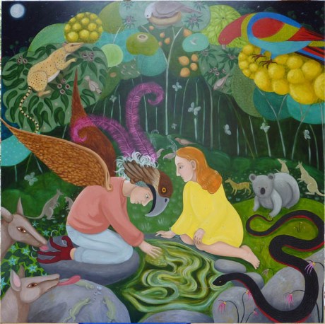
The painting The Waterhole is a case in point; it deals with the here and now, but also layers of memory, both mine and other peoples. When I was a teenager one of my friends fell passionately in love with a red-haired girl; when her family moved away from Tasmania he was devastated and spent years in a kind of psychic spin. She had a high forehead, copper hair and very pale skin (a little like Botticelli’s Venus, in real life apparently another tragic, unattainable love interest). She is one of the models for the painting’s female figure.

In the 70s one of Mum’s friends worked as a dealer in Indian miniature paintings and antiques. I loved these tiny paintings and without knowing anything about the pantheon of Indian Gods absorbed from them ideas about the anti-naturalistic use of colour, non linear perspective and richly decorated surfaces. I like the directness of non Western art: how do you arrange your composition to show that a figure is particularly important? Bugger perspective and careful strategies to lead the eye around the picture; just make him or her three times the size of everyone else. The canopy of trees in my painting is an attempt to directly reference the colour and intricate patterning of these miniature images.

Lyrebirds: something I normally have no interest in, except for feeling slightly bitter that I’ve spent hours sitting on my ass on damp ground in rainforests waiting to see one, with no result. Then TM told me about some research he was doing, tracing lyrebirds through music and art history, and mentioned an early Australian music score that referenced their song, a kind of antipodean Leda and the Swan. He’d been invited up to the University of Newcastle Minding Animals conference to deliver a paper and stubbornly arrived wearing his favourite leather jacker; a near lynching by vegans was inevitable. Anyway, the elusive lyrebird resurfaced in my mind as something beautiful, otherworldly, unknowable, exquisite, mythical and delicate. The costume of my male figure is intended to represent a lyrebird’s plumage and if you look hard there’s a couple of lyrebirds courting on the dark green grass between the couple’s heads.

This is a painting all about lost love, the boy looking in the waterhole is a direct quote of the literary tradition of people having some kind of epiphany after catching sight of themselves in a mirror.

The Waterhole

The Waterhole

And here’s The Waterhole, the final painting I finished for the Despard exhibition.

The Secret

The Secret

And here’s the final version of The Secret…

swallows and hearts

swallows and hearts

Incidentally, the second confession I mentioned at the start of today’s blog was to do with the combined forces of technophobia, laziness and being extremely busy. As part of the University’s support for PhD students I was given a brand spanking new Apple laptop, which err… I had no idea how to use. So I continued to use my old pc until it died, then was forced into the wonderful world of Apple. Yes, all the cliches are true, it’s an intuitive and well designed machine which even a fool like me can use. But it still took some time to learn how to drive so the blog got put on hold until I’d worked out the basics.

birds and hearts

birds and hearts

By the way, these heart shaped paintings are quite small, the Despard exhibition eventually had nine small hearts and three large oil paintings: The Secret, A Tasmanian Childhood and The Waterhole. As well as a few pen and ink/watercolour drawings and a couple of old oil paintings. The older work included one abstract from a period of time when I decided that it was time to have a holiday from my own style and practice of obsessively revisiting the same imagery; hence working with the purely formal elements of painting (colour, form, tone, texture, light) was really enjoyable, but it didn’t last long.

Swallows and bunnies

Swallows and bunnies

But you can’t expect art gallery patrons to blur their eyes and adopt optimistic attitudes (the bastards!) so it was time to try again. This time I decided that the sky would work well a pale silvery grey, very close to the colour of the sky in the earlier painting A Tasmanian Childhood, the logic being that a more nuetral background would act as a foil to the vivid colours of the oranges and the flowers in the foreground.

The sky got repainted one night, then worked on for a couple more days before I was more or less happy with it. The pigments were pearl white, titanium white, silver and payne’s gray. In the end the tonal contrasts were still a tad too high, this is one of the problems with working at night, and I finished it a couple of days before the Despard exhibition opened on the 18th September.

One of the bad things about being chronically disorganised/liking to work under pressure is that you typically finish work just before a show opens, which obviously doesn’t give you time to reflect on what you’ve just created. In this case the story had a happy ending: when I walked into the gallery I saw the painting as a complete image, not a series of technical problems, and fell in love with it all over again. I’m hoping it goes to a good home.

Problem number two with The Secret concerned the sky. For some reason as soon as you paint a sky blue the whole history of naturalistic landscape painting falls on your head, and if you’re not interested in working within this tradition you may as well pack up and go home.

The Secret started life with a cerulean blue sky which I fiddled with, stitching it through with lighter and darker tones to try and give it movement, a kind of embroidered dynamism, which didn’t work. I decided that the reason it wasn’t working was that the tonal range between the lightest and the darkest blue was too great, it was foregrounding what was supposed, after all, to be background. So I reduced the tonal contrasts, repainted it more light blue on slightly darker blue and stood back to consider my masterpiece. Nope, still not working.

I got brave and decided to completely abandon naturalism by painting the sky pink. As any painter can tell you, this was a dumb thing to do. Why? Because the painting of the tree was largely complete, which meant that the pink paint needed to be carefully applied in the complex negative shapes around the branches and leaves. This is fiddly and takes hours and is a job that can be entirely avoided if one is sensible and decides before beginning what colour the sky should be, and sticks with it.

To cut a long story short, I painted the sky at night using halogens to illuminate the studio, and didn’t do a very good job at ‘cutting in.’ I think I was a bit tired and carried away with the idea that pink paint would save the painting. Also, at this stage, the deadline for the Despard Gallery exhibition was looming and I knew I was running out of time to finish. When I visited the studio the next morning the pink paint only looked good if I blurred my eyes and adopted an optimistic frame of mind.

Hummingbirds e

Hummingbirds

Hummingbirds

A bit of technical trivia about The Secret is in order: last time I wrote I was trying to make the oranges look more like round fruit and less like orange circles. I was under the delusion that covering them with thousands of little dots would do the trick, and with the deadline with the Watt Space show looming, I decided to try and talk some friends into what I billed as some kind of fun afternoon ‘spotting oranges.’ (Like many painters I occasionally exploit the ignorance of the general public concerning the less glamourous aspects of our craft. I remember talking various young men into posing for me nude, for free, with breezy explanations like ‘it’s for art’ ‘I’m a professional’ etc: though obviously this was a long time ago.) The ever reliable KS turned up, spotted a few oranges, decided it was harder than it looked, and suggested that we go for coffee instead. I’ve decided that if I’m ever in a position to hire an assistant it should be someone profoundly dull, technically impeccable, who thrives on water, self denial and hard tack.

The other thing I was trying to do with The Secret was fix up some dodgy bits of drawing vis a vis the dog’s front legs and the boy’s profile. The boy’s profile looked like one of those Picassos with the eyes pointing one way and the nose and mouth another, but veiled by the oil painting equivalent of an airbrushing effect. The problem was caused by selecting a three/quarters, slightly turned angle to the face, and then not being consistent with the angles of eyes, nose and mouth. In the end I repainted it as a straight profile and it worked much better, though it did cause a kind of strange pictorial dynamic in that most of the figures on the left hand side of the canvas are in profile, and most of the ones on the right hand side are looking straight at the viewer.