Archives for posts with tag: Maitland Regional Art Gallery

IMG_5510

An odd instance of life turning full circle, but lately I’ve been working as a set painter for an amateur theatre company. The last time I did this job I was about eighteen, so more than twenty years ago, and I find I’m enjoying it just as much this time around. I got into it in the first place thinking ‘well, I like painting on large canvases, so the theatre company is really just giving me free art materials’.

IMG_5500

Unfortunately, like many young artists, my first professional gig as a set painter resulted in non payment and a fair bit of angst, so I decided to steer clear of theatre as a profession. I used to joke that ‘they’re actors, and so when they say that the cheque is in the post, you actually believe them…’

IMG_5499

This time around, I’m working for Maitland Repetory Theatre, and like the rest of the cast and crew, it’s all voluntary. Maitland Rep works out of a lovely old church, next to the Maitland Regional Art Gallery, and has a dedicated following of young and old thespians.

IMG_5497

I’ve been painting a set for The Guardsman, written by Ferenc Molnar and directed by Frank Oakes, which opens on the 10th April. So far I’ve been responsible for a not particularly convincing marble fireplace set, some blotchy old plaster on the walls, and faux wooden panelling below the dado rail. In case you’re interested in paint effects, Floetrol is my current weapon of choice, handy for all those 80s classics such as bagging, dragging, marbling, stone finishes, sponging and even the incurably naff rag rolling.

IMG_5490

Now if you’re old enough to remember the 80s, you’ll remember a time when a feature wall would have looked just like some poor unfortunate had run out of paint. Back in the day, interior designers never used to paint any surface without torturing it with some implement afterwards. So paint was scratched, distressed, sanded, waxed, imprinted with a variety of objects, or bulked up with various fillers so it acted like plaster. Why people insisted on making their belongings look old, I’ll never know, but there it is. And for a brief time in the mid 90s, I worked for a London construction company, doing this kind of work.

IMG_5486

I recently decided, largely on the basis of a casual conversation in a paint shop, that 80s paint effects were about to stage a comeback. I’d been considering buying Porter’s French Wash, a nice product that effectively acts as a scumble glaze. (Scumble glaze is sticky stuff you mix with paint so that it becomes more transparent, and you can see the brushstrokes after the paint dries; it’s as the pistachio is to shortbread when it comes to paint effects). I asked the guy behind the counter if he sold much of it, and he said ‘nah, not as much as the rest of their range’. So on the basis of this overwhelming evidence, I’ve thrown myself into a paint effects revival.

IMG_5480

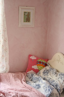
I figure that if I paint my house with these effects, by the time I get around to selling it, some years down the track, faux finishes will be a red hot trend. To this end, young Sophie has ended up with a pink blotchy bedroom (if it was a rash you’d definitely be off to the doctor) and I’m planning to attack the living room walls with a fetching shade of ochre.

Now if the ochre works, it will look like I am living in the pages of a giant foxed book, all creamy spotted and warm looking. Imagine a nice old pub ceiling, stained yellow brown with nicotine and water marks, and you’ve got the picture. However, there is always the risk that it will resemble some kind of giant animal burrow. Stay tuned….

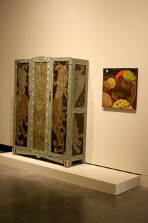
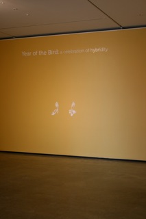
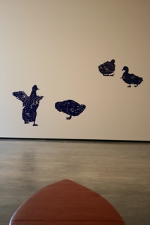
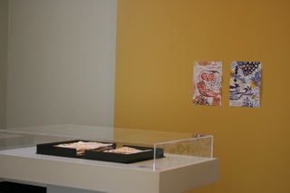
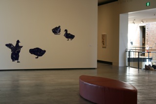
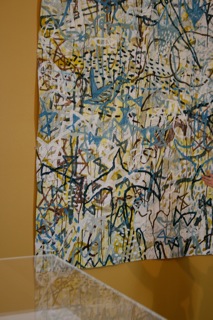
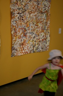
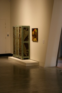
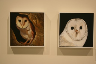
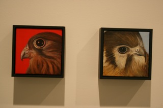
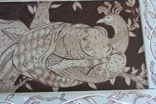
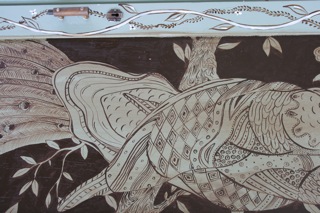
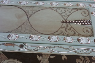
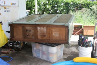
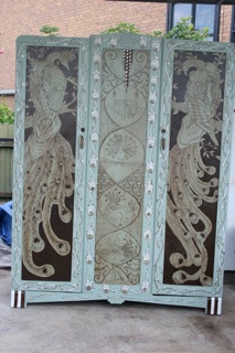
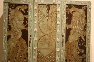
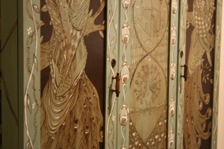
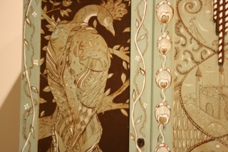
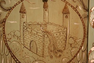
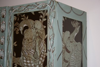
(Incidentally, I promised EH photos of the birdrobe, currently on show at MRAG as part of the Year of the Bird exhibition, and here they are. I must apologise for the quality of the images: flash on means wrong colour, flash off means low exposure and blurry shot. Either way, documenting my work is clearly a task I need to delegate).


Image


Today I went up to Maitland Regional Art Gallery to take some photographs of the Year of the Bird exhibition, curated by Caelli Jo Brooker and myself. All was going well except for two crucial factors: I’m very good at taking blurry action shots, and my little girl decided that the exhibition images would look better with her in all of them. After careful editing, I was left with a much smaller number of shots.Image


Marian Drew’s large scale photographs on the right hand wall, with Trevor Weekes’ mixed media drawings and paintings on the left. 

Image


Tasmanian painter Helen Wright’s imagery (above). 


ImageImage


Marian Drew’s work was hung on a long wall, to the right as you entered the exhibition space; in the same gallery, on the end wall, Emma Van Leest’s intricate papercuts had a large yellow wall to themselves. 

ImageImage


The exhibition is quite large, so it takes up two adjacent galleries: with the two galleries combined, the floor space is a long rectangle with a partition dividing it in half. The partition has Trevor Weekes’ imagery on the right hand side, and Pamela See’s installation on the other, with exhibition signage on the short side facing the entrance. 

ImageImage


These are images from the gallery on the  left hand side. Pamela See’s blue acrylic installation is on the partition wall, with David Hampton’s prints on the long wall facing the entrance (next to David’s work you can just see some of Kate Foster and Merle Patchett’s collaborative series). 


Image


Kate Foster and Merle Patchett’s collaborative series. 


Image


Caelli Jo Brooker’s work on the yellow wall, and in a cabinet, on the short wall of the left hand side gallery. 


Image


Vanessa Barbay’s work has a wall to itself, in the left hand gallery, on the long wall facing David Hampton’s prints. 


Image


Another shot of Vanessa Barbay’s work, with Caelli Jo Brooker’s drawings in a case in the foreground. 


Image


Pamela See’s installation on the partition wall. You can just see Helen Wright’s paintings on a long wall in the right hand side gallery. 

ImageImage


David Hampton’s prints and Caelli Jo Brooker’s mixed media work. 


ImageImage


My dear daughter pretending to be some kind of French super hero. 

ImageImage


Vanessa Barbay’s work on the left, and my wardrobe and painting on the right. 


Image


Another shot of Helen Wright’s paintings. 


ImageImage


Close up images of Helen Wright’s work. 


Image


Marian Drew and Trevor Weekes. 


Image


Marian Drew. 


Image


Final image of Helen Wright’s paintings on the left, and Trevor Weekes’ images on the right. 

Image

I thought I’d blog about my latest obsession: the peacock. While I’ve had periods of infatuation with various artists, writers, animals, men, drinks, sports and foods, this is my first time with the peacock. It began innocently enough, when my friend KRS began making these wonderfully strange sculptures of peacocks. Interested in female identity, and themes of vanity and beauty, her birds were often tied up in leather straps or wearing blindfolds. They were really mawish. 

Image


The next peacock sighting was a report by my cousin Julien from a music residency in Italy. He was holed up in a villa, a beautiful place with formal gardens, recording with a range of international and local musos. I was keen to visit, but with a young child, the timing just wasn’t appropriate. But I’ll always remember him writing me an email about the white peacock in the villa gardens. 

For me, this white peacock, has assumed the proportions of the mythic white whale. It was  the classic case of the hoilday abroad coming at the wrong stage in one’s life. Image


Anyway, I had Year of the Bird coming up, an exhibition curated by Caelli Jo Brooker and myself for Maitland Regional Art Gallery, and I was struggling to think of something to make for the show. Then it dawned on me: it was time to re-ignite peacock-philia! Caelli and her family delivered an old oak paneled wardrobe and I set about painting it in the carport. 


Ironically, birds have taken to crapping on the wardrobe, but I’ve decided that this is their way of expressing admiration. I’ve had a great time getting OTT with peacocks. On the wardrobe, which has some nice Art Nouveau panels (the shapes seem to suggest what subject matter they’d like to have on them) I’ve painted all things peacock.Image


There are peacock wings, peacock feathers, peacocks sitting on castles, Art Noveau/vaguely Japanese inspired peacocks, peacocks displaying, courting peacocks, (curried shrimp…), and various designs that are supposed to remind you of… the peacock. It’s never going to win any good taste awards, I’m quite certain of that. Image


As the damned thing needs to be delivered to the gallery on Monday, I really need to finish it by Saturday to give it time to dry. The next step is to paint the decorative side panels, then I’m going to pick out some more highlights with white paint, toned down with a bit of burnt umber. Image


From a purely parsimonious perspective, I’ve got to admit to loving the underpainting in burnt umber technique, because the pigment is the cheapest of the range. Also, the thin paint applications mean that so far I’m only about three quarters of the way through a small tube, which is pretty good as I tend to be a bit of a paint hog. Image


Ah, the romance of the open studio! Plein air painting at its most budget. 

The next step will be to apply some thin washes of colour, hopefully once the flecks of white highlighting have dried, otherwise it’s going to be a horrible mess. Finally, the wardrobe will get a coat of sealer (if I have time) and some brown furniture polish. The theory is that the polish will tone down some of the colours, and make the green trim, which is a rather yucky spearmint chewing gum colour, look a bit more nuanced.Image


Thanks to Holley Ryan, who very kindly painted our faces with peacock designs, during a recent visit to EVM. 


Image

The year has started well, with something of a pile up of creative projects, which is nothing to whine about, but does present some ‘what the hell should I do first?’ scheduling issues. I got interested in time management and efficiency a while ago, and wasted countless happy hours reading about spreadsheets, productivity cycles and cognitive patterns. It was a great hobby while it lasted, but I can’t actually say I walked away from the phase with anything concrete other than ‘always do the fun thing first’, which is actually diametrically opposed to lots of this kind of advice. 

Next week I start a commission to write the 25 year history of Hunter Valley Grammar School. I’ve never written a local history before, so I’m looking forward to some happy hours in the library, and hanging out with archivists. I’m thinking I really should start wearing my hair in a bun…

I’ve also got to finish the perennial PhD, as my scholarship is running out at the end of next month, and what was a delightful hobby has suddenly become an urgent matter. It turns out that the University really likes their PhD candidates to finish more or less on time, and has suddenly pulled out a dazzling array of sticks and carrots. One of the best carrots, by the way, was some great workshops run by Thinkwell. (It was actually Thinkwell that got me interested in time management, and also wondering why procrastination ever acquired such a bad name). 

The PhD started off in Fine Arts, and for a variety of reasons recently jumped across into the English and Writing program, specifically the Creative Writing strand. This means I’ve got to write a novel length work of fiction, then turn around and analyse it in another longish document. I always imagine that this is a bit like an 18th century surgeon operating on himself at sea: you get to see how your guts work in a stressful environment. I’ve got to admit to being perfectly happy with the creative side of the project, no issues there, but the actual analysis and contextualisation of what I’ve written causes some psychic discomfort. 

The good news is that the creative bit, a novel that was provisionally titled Scheherazade’s Sister, and is now more likely to be called Catharine: a reverse fairy tale, is nearly finished. Of course when I say nearly finished, I’m lying: this is just in case my supervisor reads this. I have nearly completed the first draft, but for me this is the hard bit, where all the structure, action and themes are worked out. The subsequent drafts are more in the nature of having fun fiddling with language and seeing how things can be improved. 

Catharine is a character who haunted me so strongly that I had a phase of imagining her walking around the house in a pair of clunky high heels. She insisted on having her name written in a particular way. It was all rather Six Characters in Search of an Author for a while. It wasn’t until I started writing her down that her (entirely imaginary) restless presence started to fade. But I’ll write more about this in the future. 

Image

Meanwhile, far away in another part of town, Caelli and I are continuing to pull the various strands of the Year of the Bird exhibition together, including finishing our own work. The exhibition is due to open, to the funky sounds of Kahibah Funky Brass band, at Maitland Regional Art Gallery at 3pm on Saturday 23rd February. I’m hoping that we get lots of people at the opening and that everyone wears bird masks and dances. 

Image


Helen%5FIMG%5F5049%5Frgb%5F300%5F20x20

This painting, moonlight on your beak, is one of the ones I’m working on for the upcoming Year of the Bird exhibition at Maitland Regional Art Gallery. The plan is to produce two paintings and one painted wardrobe. I was outside this afternoon, trying to scrub the last of the old shellac based varnish off the wardrobe, before the rain started. Thanks to the guy in Eckersleys, my local art store, who suggested that methylated spirits and wire wool would do the trick.

And here’s a portrait picture, taken in front of moonlight by Caelli Jo Brooker today.

Helen%5Fmono%5F300%5Fcrop%5Fvsmall


I’d been whining about how I needed a headshot for a magazine article and Caelli very kindly took this one. I like a number of things about the photo, mainly that it appears that I have a bird perching on my head, but also because of the flow of the composition: it leads your eye round in a nice swoopy circle and then along the path into the painted woods.


Image

Rather disgustingly, this blog has recently lapsed into ghost ship status. This is not, however, because I’ve done nothing creative, and thus had nothing to write about; it was unfortunately quite the opposite situation. 

Incidentally, the above pic is some work that was recently installed for about a month at Hobart airport. The paintings are Tiger Bride, an image that I’ve previously blogged about in detail, perhaps too much detail; and Whalesong, an image inspired by the collision between the NZ flagged Ady Gil and the Japanese whaler Shonan Maru 2 in Antarctic waters in early 2010. 

Image


A more current project that I’ve been working on is Year of the Bird, a group exhibition at Maitland Regional Art Gallery, that explores the prevalence of bird imagery in contemporary art. Year of the Bird includes the work of Marian Drew, Emma van Leest, Pamela See, Vanessa Barbay, David Hampton, Trevor Weekes, Helen Wright and Kate Foster (UK). Very kindly, Drs Yvette Watt and Nigel Rothfels have agreed to write an essay and forward for our catalogue. For more info about the show, and some nifty images, here’s a link to the exhibition blog

The show is due to open at 3pm on Saturday 23rd February, all welcome! 

Image


This is a mock up of what the exhibition will look like in the space.

Year of the Bird is curated by myself and Caelli Jo Brooker, we previously worked together on Happily Ever After, an exhibition of artists’ books with a fairy tale theme. I remember years ago seeing a really funny t-shirt with a picture of a gun and the slogan ‘whenever I see the words artist/curator, I feel like reaching for my Smith/Wesson’. And yes, once again Caelli and myself are doing the unthinkable by including our own stuff in a show we’ve organised. Caelli’s doing these beaut large scale expressive/scrawly/graffiti inspired museology mash drawings and I’m currently painting birds all over an old wardrobe, and trying to finish off two small canvases. 

I recently moved house, and somewhere in the process of realising that I’ve acquired far too much crap, I cleaned out my back shed and discovered a couple of old paintings of girls interacting with birds. One image, provisionally titled moonlight on your beak, shows an ingenue in a moonlit clearing gazing up at a spectacularly large parrot, with light glistening on his beak. The other was inspired by a hilarious short story about a young girl who was trying to work out which was the ideal pet for her: a parrot or a macaw. She eventually concluded that the macaw would definitely be the more dangerous of the two. Anyway, the image shows a girl in a pet shop gazing longingly at a huge parrot stuffed into a tiny cage. I’ll post photographs when I have them.

The other major time sucker in my life just now, apart from the perennial PhD, which is actually not going too badly, is a rather embarrassing ideological transition that is currently taking place (cynics would label it ‘growing up’). I should just shut up about it, and not risk public humiliation, but as my friends have been teasing me about it, I think it’s probably time to ‘fess up.

I recently brought a second house (the unlikeliness of the purchase continues to surprise me) after a dedicated three month stint of pretending to be a financially responsible adult in order to impress the bank. As they were unlikely to lend money to an artist/writer/single parent/self employed/casual employee, I got a real job with payslips and everything. The shock/the horror. The dedication it takes to turn up to the same place and do the same thing, or variants of it, nearly every day. But the good news is that the bank brought my carefully constructed facade, and decided to lend. 

So my new house is very run down place, with some truly amazing carpentry, hideous grey walls and a layout that reminds me of Prisoner Cell Block H (a long central corridor with small holding cell rooms off either side). It has a motorcycle tyre prints on the kitchen floor, where someone has been doing burn outs, and a crack the size of the Grand Canyon in the bathroom floor.

But it’s mine, and it represents a substantial plunge into the whole capitalist ethos for someone who spent a good portion of her life living out of one backpack, in boats, squats and slum accommodation, who lost everything she owned a couple of times, and never thought she’d own anything. 

More confronting is the inner ideological shift this acquisition represents. I never considered money as something that was particularly interesting, but now I’ve started to see how its deployment may be something that is akin to creativity (in that it involves decision making, planning, strategy and sometimes even instinct). Mind you, in a couple of years time, or if the real estate market tanks, I’m sure that I’ll be crying into my beer, but in the meantime I’m thinking that this is a kind of fun thing to do. 

Here’s a funny blog about personal finance that I discovered recently while searching for free accounting software for artists. I was struck by how sustainability, in all its guises, is implicit in many of her ideas.